Tuesday, March 22, 2011

The riskiness of publicity, or, Diego Rivera’s Ghost


After speaking with Amy Johnston, director of Public Engagement at the Mural Arts Program I’ve been thinking a lot about institutionalization. This project was initially framed as something along the lines of “Polemical Murals” and “media space,” with the idea that I would uncover the hidden anxieties and the terrain of domestication and quietude that occurs when an outside art, muralism, becomes integrated into conventional urban processes. I have not by any means cracked this puzzle but what I have decided is that the initial story that I set out to be my frame: from revolution to tourism, risk to convention, from Diego Rivera era murals when muralists had to paint with guns at their side to protect their art, to the present, when artists can calmly provide background and context commentary about their work to be listened to via ipods, pdas and cell phones implies a judgment about the trajectory of mural arts that assumes institutional engagements involve zero risk. I wish, in this post, to amend that overly simplistic, and nostalgic, view.

Publicity involves risk. It risks the artist’s ego, it opens up how and what a neighborhood means to debate, and the end at product, whether it is a mural or a large scale photograph or digital projection is both literally and discursively available for commentary, criticism, and defacement. I want to illustrate this point with two anecdotes, from Amy Johnston and JJ Tiziou, and with two murals.

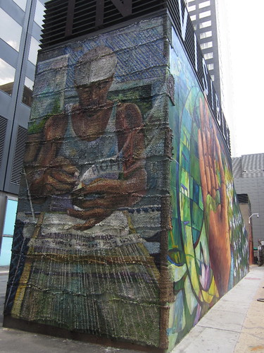
Amy, in generously talking to me about the current trajectory of the program explained Mural Arts’ emphasis on innovation and searching for new forms. She explained that as a public-private organization so in some sense a city agency, Mural Arts has to approach issues creatively rather than polemically. For example, Powers’ Love Letter project is geared towards revitalizing the Market Street corridor as well as offering a homage to Cornbread. The project presents a series of cryptic, ambiguous messages instead of direct demands or statements. Additionally, Love Letter stretches Mural Arts’ previous aesthetic patterns. The project represented a stylistic departure, since Powers’ project is predominantly text based, and MAP’s projects are primarily image based. Furthermore, since, as noted in an earlier post, it is an experiment in the longevity of different styles of paint, and the walls had not been investigated for architectural and social longevity with the depth Mural Arts usually does, the project challenges the notion of permanence to which Mural Arts usually adheres. Love Letter then exposes the frailty of murals as durational objects, the multiple contingencies that go into their persistence (wall structure, paint process, and the wall owners’ plans for the walls), as well as the possibility of multiple non-representational forms being community art. Amy also mentioned a grant that was recently acquired to continue working with the Department of Behavioral Health on issues related to homelessness, and doing further research into the therapeutic benefits that art making provides. The major project related to this was a Mural titled “Finding Home” which is on the mural mile tour, at 13th and Ludlow. Led by muralist Josh Sarantitis and muralist and weaver Katherine Penneckaker, Katherine worked with the homeless in taking fabric (parachute cloth) and then writing their stories, hopes, aspirations, fears on the cloth, and then weaving it into mats which were adhered to and then mounted on the west side of the mural. The materiality of the mural, that emotions are embedded into cloth and then placed onto the mural itself exhibits a great risk in terms of exposing the material products of affective labor to the elements, to defacement, and to potential destruction, as well as, of course, pointing to issues of invisibility and vulnerability that impacts homeless individuals (The mural, on top says IN VISIBLE DIGNITY and based on how one is standing, either on the south side of the mural it says Visible Dignity and on the West side it says Invisible). Pannepacker continued weaving classes with the homeless after the project ended and has turned it into a kind of skills building class where they make scarves that they then can sell. Amy remarked on the remarkable emotional work that this project does, but also that it is a learning experience for mural arts that provides information which the Department of Behavioral Health, a partner in the project, can use to better their other programs. Art here as experiment, Amy noted also means that Mural Arts is aware of the importance of acknowledging the value of mistakes and learning, and that flexibility is afforded by the strong institutional structure and time tested methodology for engagement that Mural Arts uses. The humility infused approach to restorative justice here suggests an openness to fallibility, and in face that it is embraced. This resonated with JJ Tiziou’s discussion of making the photographic archive available, not just showing the photographer’s “Portfolio shots,” to make understandable the relations and process involved in the making of an image.

Image making as creative, mistake laden, and not always perfect suggests the ways that institutional identity and a municipal partnership instead of opposition still leaves room for play, transformation, and innovation. On the Love Letter tour our guide cited a prank that Steve Powers/ESPO played in New York. He said that painting graffiti at night is not challenge, but painting during the day, that is something else. He painted 80 store-front aluminum gates, and when asked by residents, police, visitors what he was doing he said he was with the Exterior Surface Painting Outreach. The joke here of course is that a fake institutional identity provided cover for technically illegal acts, but the claim that painting is more difficult during the day can be extended metaphorically to complicate the Revolution/Institution binary that muralism is sometimes subjected to. Painting in the light of institutional, bureaucratic, public review, community meeting, wall certification day frankly seems like an immensely difficult and often frustrating process. The artist has to be willing to propose, adjust, re-propose, weather criticism and synthesize neighborhood feedback while still trying to be innovating and engaging. The work has to withstand demographic, historical and climactic alterations. The meaning of the work is vulnerable to appropriation, recontextualization and transformation. There is an immense risk in making objects available, public, and popular.

Diego Rivera carried a pistol, but he was also sponsored by the Ministry of Arts, the murals being a pet project of Vasconcelos. Revolutions and institutions share space, objects, and concerns. A block east of the Thomas Eakins House where Mural Arts is housed there is a mural in honor of Diego Rivera. It shows him sitting and eating at a table with other artists. In this seemingly banal scene what impacted me was the way that human lives move through many different spheres, and though claims made might be institutional or anti institutional, the persistent animating concerns and energies elide such easy classification, and relate to attachments to spaces, need for affiliation, and the impetus towards creation.

What happens if we suspend declarations of right and left and instead focus on creativity, innovation and augmenting energy? Spinoza says that conatus is the drive to affirm life, to pluralize connections, to maximize energy. My provisional suggestion after this extremely puzzling, exciting, and rewarding week is to think about the political work that these murals do in a complex media space not as polemical but instigative, provoking, and energy maximizing.


Many many thanks to Amy, JJ, Andrew, Kevin, Cara, Jon, and others I have talked to in weathering my flat-footed questions and in being immensely generous with their time, knowledge, affiliations, and resources.

Monday, March 21, 2011

Billboard Wars: How Philly Moves, Alternative Image Economies


How Philly Moves, a project set to be unveiled in June of 2011 challenges classic definitions of what mural, community, and audience. A 50,000 foot long installation to be painted on the Philadelphia International Airport Parking lot it is a collaboration between photography JJ Tiziou, the Philadelphia Transportation Authority, and the Mural Arts Project.

A discussion with designer and photographer for the project, Tiziou helped to illuminate some or these concepts. The project was the brainchild of a previous proposal that Tiziou and a friend submitted in a project for the 52nd Street El line that did not go through. It was dance themed and was based on the notion of recruiting Philadelphia dancers to do photoshoots of their dancing. Tizziou resubmitted the proprosal to Mural Arts and it was approved, and he works with Jon Laidacker and his team in designing the proposal.

How Philly Moves will be a mural painted onto the airport parking structure, that has been produced via tracing photographic stills projected onto parachute cloth, and then painted in. Short film clips and stills projected over it will also be projected on part of the Kimmel Center wall during Philadelphia's International Festival of the Arts (PIFA) in April. The Kimmel Center projection will coincide with the beginning of painting.

One of my questions to JJ was about questions of medium and genre. He explained that photography can be made into a public art based on its mode of dissemination, by making images that go directly back to the subjects, "celebrating communities through image making." How Philly Moves is just one node in a broader project to democratizing the production of a city's image. One way that JJ makes images of his subjects accessible is by including the photographic archive on the project website. Instead of presenting the single polished image he also makes available the ones the he is "not excited about, but someone else might find it important." The shift to digital photography, he noted, might tie us to our computers, but also decreases production costs and allows widespread dissemination to multiple audiences. It decreases the authorial control of the photographer but also amplifies awareness of photographic process as one which is based strongly on movement, improvisation, fallibility, and relationality. "Photography is a dance," JJ explains, one which involves anticipation, improvisation, and a large dose of contingency. Because viewers will encounter the mural from I-95 going North or South they will have to engage the work quickly, in movement. Similar billboards in its monumental scale it offers an alternative to their consumptive messages, one based on human potentiality rather than commodified objects.

The introduction into photography and film into a still mural challenges the definition of the mural as a static painted object, but bolsters the importance of it as a process of collective engagement. Further, the digital elements of the mural do not make it unreal or virtual. It is just one part of a discursive network which has lines in many different parts of city, the Kimmel Center being one.

The Kimmel Center projection will occur on the Broad Street side of the Kimmel Center, a major thoroughfare in Philadelphia with all kinds of vehicles and pedestrian traffic. I asked JJ if he anticipated that viewers would primarily be art viewers interested in PIFA. He declined, explaining that the intallation's position on the exterior of the building means that people coming out of work in the middle of the night, volunteers or visitors to the neighboring homeless shelter, art festival attendees not aware of the exhibit stumbling upon it accidentally, or residents commuting to work "can't avoid it." Again the artwork is something that is easily accessible operating in a wide range of contexts. It is similar to a traditional mural in this respect.


What is sustained is a commitment to publicity, contingency, and resisting the reduction of the art world to an regime of experts. Murals as alternative image economies to that of mass media suggest the way that public art can establish alternative lines of communication and forms of association that work through multiple discursive networks (the installation, the archive, the monumental mural).

Sunday, March 20, 2011

Love Letter: A Not so Secret Affair with Graffiti


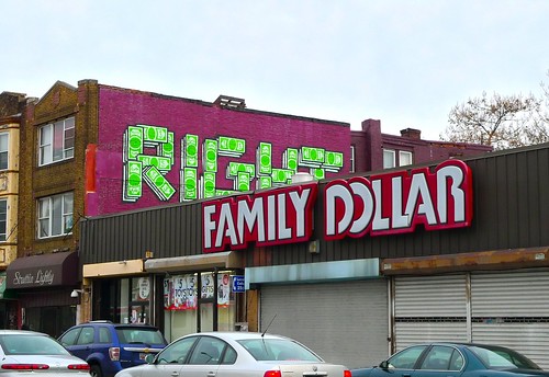
According to our tour guide on Saturday, while explaining the “Right” mural, Steve Powers had said of it “You ain’t got romance if you ain’t got finance.” The comment can be amplified out to provide a frame with which to think the material infrastructure necessary for urban spaces to become loved, and what the conditions of possibility for love is.

For an urban space to be a loved space it needs to have a history, a character, and a recognizable mode of address. The Love Letter project because of its style, intertextual references and spaces of inscription provides a history for graffiti but one that is made legible to audiences who ordinarily might not be aware of or looking for the complex social economy of the graffiti world. However it can only do so because of the economic and cultural sanction that it has been allowed by its being sponsored by the Pew Charitable Trust and the Mural Arts Project. To tell a story about graffiti art and to use the tactics and styles of that art the project has to operate under the mantle of muralism. Nevertheless, graffiti history ghosts the tour, many of Powers’ addressee’s being other graffiti artists, even though the tour is explicitly marketed at Powers’ love letter to the city. The city gains specificity as a city that is as much Powers’ remembered city as the Philadelphia in the present. I will discuss two pieces, and one anecdote in particular.

During the tour repeated references are made to Powers’ persona he is “Kramer-like,” a “character,” “quirky” and a former tagger who ahs “grown up.” A kind of teleological narrative is given about the move from tagging to muralism, and Power as a prolific tagger in the 80s, who refused Jane Golden’s (Executive Director and Founder of the Mural Arts Program) offer to join the mural arts program, and now sees the light, seems like the perfect and complete PR story that links the basis of the Anti Graffiti Network (the Mural Arts Program’s prior moniker) to the Mural Arts Mission of today.

The pieces themselves suggest something slightly more complex, and Powers’ blog gleefully provides additional pieces of ambiguity rather than solid answers. One piece of note is what the tour guide called a “shout out piece,” which she explained was painted by Powers on a wall already painted by a friend of his, Razz. After much mental flip flopping, even though Razz had given is permission for Powers to repaint, Powers decided to partially paint over it, turning it into a piece that paid homage to his friends. It is total nonsense to the outside viewer, or interpreted as a mystical piece . It does not at all related to the Love Letter series in that it is not gesturing towards romantic love, but rather friendship and non-exclusive intimacy. It also suggests that the multiple connections forged by Powers to the streets of Philadelphia are shot through with connections to other taggers, that it is both a geographic and social space. Were it not for the “# 30 in a Series” and Pew and MAP sanction it would be structurally identical to graffiti murals boasting crew and individual tagger’s names found all over the world.

The stylistic affinity with graffiti came to the fore more clearly in a mix-up surrounding the “Day Care/Car Fare” piece. It is visible in the skyline photo on the left foreground. That piece was completed in the summer, and then as the night time wall cleanup crews passed by it a member of the crew who had been working for over 25 years identified it as Powers’ work, known as ESPO as a tagger. The tour guide informed us at the outset of the tour that taggers painting at the level of elevated trains was common because at that height the night cleanup crews would be loath to climb up and remove their work, bestowing on it some level of longevity, which provides some context for the crewman’s reaction. The crewman said “I recognize this work it is ESPO’s we need to take it down.” The other crew members pointed to the Mural Arts insignia and the worker protested, saying that ESPO was clever and had likely appropriated the sign. The tour guide also informed us that the crew man had had to clean up a huge amount of ESPO’s tagging, so during the eighties no love was lost between them. So they painted out the “Day Care/Car Fare” piece. Jane Golden visited that morning to see the completed work and found it painted out, and realized the street crews had not been told about the Love Letter Project. Reluctantly telling Powers, he reacted with humor and insisted on having lunch with the cleanup crew worker to relive times gone past. What is notable in this narrative, beyond the happy tale of reconciliation and convergence between a reformed graffiti artist and unaware street cleaner, is that the mural was understood by experts in the field of graffiti art—street cleanup crew workers whose livelihoods are based on finding and eliminating graffiti- as structurally the same. The only difference was the kind of authorizing insignia.

The Love Letter tour then also reenacts the drama of the city’s fight against graffiti, and resolves it not by expulsion but integration. As noted in the earlier post, Powers’ conceived of the project as a kind of mimicry of Cornbread’s graffiti love notes in the 1960s. The vast discursive apparatus surrounding Love Letter has offered a kind of accidental institutionalization for graffiti turning it into an object of love, nostalgia, and visibility. However it is not by changing the form or content of the art but the channels of approval that it follows. If you aint got finance, institutionalization and legitimation, you ain’t got romance.

How does graffiti ghost Philadelphia's landscape? What affective geographies does it trace?

Saturday, March 19, 2011

Intimate Tourism: Affective Modalities


Philadelphia is the “City of Brotherly Love,” or more gender appropriately (thanks to Emily Winderman) “The City that Loves you Back.” It is appropriate then that the major Philadelphia tourism corporation and the Mural Arts Project have love themed approaches.

“Love From Philly,” coined by the Greater Philadelphia Tourism Marketing Company (GPTMC) began in May of 2009. Meeting with Director of Marketing, Cara Schneider, today she kindly talked to me about the genesis of the “Love from Philly” campaign. She said that it emerged in 2009 out of a meeting with most of the Philadelphia tourism industry representatives responding to a “vague feeling” that a change in strategies should occur in the wake of the 2008 recession. Cara says:

“That was really our CEO’s brilliance: in 08 she felt like she was beginning to see different patterns, you know, she obviously reads the papers, and you know just talking to restaurant owners and hoteliers and all the people we talk to all the time, there was a sense that things were shifting people were getting nervous, there was a new need, social media was usurping traditional media, and all of those things were just giving people a sense of ,not of impending doom, but of something is changing down the pike and we need to be doing something differently, it was a very vague feeling and there was a call for a big idea.”

Here marketing is understood as successful attunement: paying attention, looking for patterns, being receptive to social anxiety—in short it is a kind of affective mapping.

The Love Letter campaign is a series of playful letters, written in handwritten font, signed “Philadelphia XOXO” with short inviting messages about things, people, and characteristics of Philadelphia. It is still occurring, and targets general audiences, but also puts out lines for specific demographics.

I asked Cara about the graphic design, and what the intent was and what kind of voice it established. She noted:

“Philadelphia’s campaigns have always involved love and humor and personality in different ways. That one, the handwriting is fun because it personalizes the city, the theme of the campaign, the idea behind it is that the letters are coming from Philadelphia itself and Philadelphia is a place that has sort of a likeable chummy personality, we certainly run the gamut between the experiences that range from bad Eagles game experiences to Hope Montgomery Scott and the Philadelphia story type experiences, but, solidly in the middle there is this approachable, palsy type of feeling with a little color and a little attitude and whatever. So the tone of the campaign could reflect that—and a little sassy, but ultimately respectful, and you’ll notice that the letters never, they never outwardly insult anybody else… developing the voice was an important part of the campaign and it has always been important for us to have a little humor. And that come through in speeches Meryl [CEO of GPTMC] gives and the way that we handle some crises and in a lot of the campaigns.”

Tone, affect and a sense of humor not particular message are the defining characteristic of the letters. They establish conduits of inimtacy to strangers mediated by references to known sites, cultural tropes, or feelings. Instead of a particular image Schneider describes the marketing strategy as one of affective mapping and responding to the needs of “whole people with diverse interests,” not a segmented tourist experience that happens in a discrete geographic zone.

The Love Letter tour is one example of the kind of multimodal and integrative tourism that Philadelphia is moving towards, but one that mural arts required from the outset.

The Love Letter campaign painted by Stephen Powers, a former graffiti artist known as ESPO was unveiled in September 2009and sponsored by a grant from the Pew Charitable trust, and coordinated by the Mural Arts Program. The “Love Letter Tour,” which has been offered year-round since the project’s completion is a fifty piece series along the Market-Frankford Blue Line East-West line on the elevated tracks between the 46th street station and the 63rd street station. Stephen, who is a Philadelphia native and tagged all over Philadelphia in the eighties responded to a call for a project to draw attention to areas which have been less economically viable in recent years.

The tour is led by Mural Arts docents, and they meet tourists at the Love Visitor Center at Love Park, north of City Hall. My sister and I went at 10 a.m. this morning, along with a group of four thirty-ish women, a middle aged woman, and a college/early twenties girl. Describing the tour in its entirety would flatten it, and also take too much space, but one of the most striking elements of the tour is the importance of one orienting ones body appropriately in space.

The tour guide made sure to caution us early on to expect not to see all of the murals. Unlike a gallery experience or City Hall the object does not hold still even though the murals are on fixed surfaces, because the mode of viewing is one based on movement. The murals, although painted in bright colors, are carefully integrated into the building spaces where they are installed, and so often emerge out of unexpected corners saluting the viewer as they speed by on the Market street sign. One has to constantly look from side to side, and it is an active train used by commuters who are not just on a leisure trip. Jockeying for seats occurs, the train horn blares on and off. And the murals never look exactly like they do on the website—the project is also a study in the longevity of different kinds of painting techniques so over the last two years the installations have been allowed to fade, making their colors change dramatically.


Further, we were told that we would be “in the public” and so should not expect there to be room in the train, to be able to see outside of every window, and for it to be quiet. This was made concrete was we walked through the Suburban Station entrance to the Market Street Station and walked past several sleeping homeless people, and waited with several other commuters.

The contingency of the tour reminded me of walks I’ve taken through wildlife areas where I do not know if I will see every kind of wildlife: approaching fifty works of art at high speed from an unstable and optically occluded viewing station through light on the fact that urban space is intensely alive. It changes over time, reveals and hides different things from the viewer based on time of day, weather, the viewer’s level of attunement, and so forth.

The messages in the Love Letter tour underscored and complicates the “voice” that Cara Schneider explained to me as an exemplary model for Philadelphia. The Love Letter tour is working in the tradition of another Philadelphia tagger, Cornbread, who in the 60s left love notes to his girlfriend on Philadelphia walls (http://webcache.googleusercontent.com/search?q=cache:rt96ZPd8aEwJ:modernhousenotes.blogspot.com/2010/03/little-break-from-modern-architecture.html+cornbread+philadelphia+tagger+love+letter&cd=2&hl=en&ct=clnk&gl=us&client=firefox-a&source=www.google.com)
It is playful, and intimate, but in a way that is based on the most banal everyday objects and interactions, and as noted above, destined to decay. So there is love but also a sense of the fragility of love because of the ephemerality of the works.

Further, the site specificity of the murals implies a dependence on a constantly changing environment, and in some ways might contain the seeds of their obsolescence: they mostly gesture to their sites of inscription, for example, the “Right” mural is composed out of dollar bills and is over the Dollar Store, however, one of the functions of the project is to increase commercial traffic on that twenty block strip of the Market Street corridor. However, increased money flows will necessarily change the face of the streetscape, leaving (if they remain) the murals as ghostly relics of times past.

Finally I’ll note the strategy for the campaign—that of attention getting and increased SEPTA ridership—by soliciting the attention of riders through love notes from unknown parties lays bare the importance of creating new affective maps through cities in order to change their economic terrain. The bodies that orient themselves towards looking out into neighborhoods that previously were mere background associate those spaces with humor, sincerity, and conviviality.

On a more cautious note I am curious about the role that movement plays in abstracting the pieces from their locale. Concretely I mean that when on the tour we never left train stations. Part of this is economic: it would be an extra two-dollar token to re-embark every time, however, part of it creates a sense that one need not encounter the work at street level. To what degree are intimate, face to face encounters with people that are the stewards of mural arts necessary? Does the mediation of the train, the docent, and, if one takes the tour on their own, the map, transform neighborhoods between 46th and 63rd into gallery walls or does it in fact energize those spaces in the imaginaries of strangers?

Thursday, March 17, 2011

Towers and Tunnels: Thinking about Space and Ground in Philadelphia


Yesterday I revisited (literally) the Magic Garden to walk around the space after going to City Hall to take an interior tour and tower tour. There are of course clear differences that would make the comparison of such sites laughable: City Hall was designed by William Penn and adorned by Alexander Calder (the mobile artist’s great grandfather), and predates the Magic Garden by several decades, and one is an active municipal site, while the Garden is in a residential area, however, both are city landmarks and icons of Philadelphia. They exhibit an interesting co-relationality between the dialectic of ground and space in contemporary urban discourses. By “ground” and “space” I am referring to the way that Kirk Savage parses the design upheaval at the National Mall between the 19th and 20th centuries.
In Monument Wars Kirk Savage argues that the National Mall in Washington D.C. has undergone a major transformation from a wooded, circuitous dense ground with monuments popping up surprisingly to the geometric, imperial, clean-cut designs we are familiar with today. Savage suggests that this transformation is related to the difference between 19th and 20th century concepts of public space. He notes that there is a “a long term tension between ground (“concrete, messy, diverse”) and space “empty, abstract, pure” and that we “populate space with gods” with contemporary urban planning rendering space as the “protagonist of architecture relegating ground to a “platform” (12-15). Specifically in the context of the massive urban renewal and bulldozing that had to literally occur to make room for the new national mall this physical destruction was necessary to create space for a new national imaginary wherein the “nation would free itself from the sentimental weight of localities and emerge transcendent” (15). Here there is a kind of mutually exclusive relationship between the nation and the local, with the nation creating a space for itself by destroying local attachments (167).
Similar questions and concerns occur around municipal urban design. The Magic Gardens emerged as a response to a city proposal to create a highway through South Street—much like the Wall of Respect in Chicago in 1967 the Gardens created a visible mark of communal ownership and communicative action on a literal space, performatively resisting city designations of the South Street neighborhood as “blighted” and “decayed.” In short, real anxieties should arise when singular definitions for either nation or city are put into play.
Therefore, when visiting City Hall for the first time I was markedly nervous about the grand narratives that might be told creating about Philadelphia. One of the animating concerns of this research project is the politics of tourism, and how touristic viewing shapes subjectivities and intersubjective negotiations in urban space.
City Hall, and the northeast tower in particular, is constructed via an architectural design that attempts to tell a story of coherence, and progress. It does (the building) aspire to create a notion of public space (not grounds). However, the contemporary space surrounding the building (the inner plaza in particular, and the city map that one sees when in the Tower), as well as the human interactions at work in the building belies this totalizing narrative.
To enter the building one walks through one of four tunnels, one on each side of the building, and can continue into an outside courtyard. In the courtyard there are two metro entrances, and a great deal of construction. On the temporary walls there is plastic sheeting with images of the construction process (it is a project to clean the building and de-rust the windows), and on the north side a mural sponsored by the Mural Arts Project with Eric Okdeh and Kien Nguyen as lead artists. In the center of the courtyard is a faded flagstone with a map of Penn’s design of the city. Standing in the courtyard, looking west, the building is literally divided in half in color and in the distribution of scaffolding. One side is white and one is yellow. As I learned from the tour guide, by the time the building was constructed, which took thirty years, it had been blackened by pollution and had to be scrubbed clean, which was the process under-way at this moment. The mural shows different statues on the four facades of the building with Philadelphians performing ordinary activities next to them—it seeks to integrate a historically anachronistic space into the everyday imaginaries of the population through an aspiraitonal act of realist muralism. However, I wonder about the effectiveness of the mural. It is in a crossing space that people walked quickly through in an unceasing flow (save for tourists like myself and business clad people using the courtyard as a meeting space). One issue that one might raise is the degree to which the triumphalist architecture of the building can be integrated into the social “grounds” of Philadelphia. What I provisionally suggest is that it can but only in temporary and playful moments, which requires the leisure of touring, which is to say that space and ground should not be held in a strict dichotomy but rather function rhythmically and in complementary in the social landscape of cities like Philadelphia.
I have not gone on many City Hall tours, probably not since the second grade, but the ethos of the tour guide is one that seems fairly standard: jovial, knowledgeable, and light hearted. Early in the tour when asked why the Penn statue atop the tower points northeast the guide responded “He either points to where he signed the North West Ordinance or to a whorehouse in Chinatown.” Perhaps these both are true.
There are of course important exceptions based on subject matter and location but for this particular tour the focus was on architecture and design. Walking us around the outside of the building, a group of myself and five other women and three men, the guide, an elderly gentleman named Paul repeatedly drew out attention to the materials, the genre, and the author of the works. We were taken to the Mayor’s press room, where several fellow tourists gleefully took pictures behind the podium, and then in the Supreme Court room sat in the Justices chairs. Whereas the guide emphasized the permanence and durability of the building structures, the participants seemed excited to act out a kind of political identity. Further, the materiality of the building itself belied any attempt to create a narrative of continuity: the constant flow of trucks in and out of the building forcing us to move around awkwardly, the many workers on the scaffoding, and the ongoing processes of maintenance and repair that go into sustaining the edifice of a historically vulnerable structure. One gets a view of Philadelphia from the perspective of abstract space in the tower, which reveals the straight plane of Broad Street, and the Ben Franklin Parkway, leading to the Art Museum, but is startled by the looming dark mass of William Penn’s boot only a few feet from one’s head if one looks up. This, I think, is not an invulnerable spatial ideology but one that is impacted by the contingency and ongoingness necessary to maintain a historical structure.
However, to return to the Garden, the clear groundedness of the environment; it is made out of found objects from the neighborhood, reflects back the viewer as well as its atmosphere, and offers tunnels stairs and crawlspaces that enable a very rooted and subjective experience, it also offers a very different ideology vis a vis decay and mess than City Hall. Whereas a vast infrastructure is in place to clean the 700 room building, when I encountered Isaiah Zagar in the garden and asked him what he did about bad winters, pollution, and erosion of the work he simply said “That is part of it.”
However these reflective grounds are not opposed to the city’s “official” identity—remember that the gardens were incorporated by the city. What this suggests to me is that the opposition between official and vernacular, between grounds and space, ought to be tempered by the way that cities like Philadelphia offer layered visages to tourists, one that suggests the multiples discursive and spatial fields that tourists and residents alike move through. Zagar, after reviewing for me different genres of murals: “Social realist, abstract, expressionist…” responded to my question “where does this” I gestured to the garden “fit in?” and he said simply: “Great art, it is just great art.”

Moments of Inauguration and Spaces of Fragmentation: The Signer and the Magic Mural Garden


In this post I think about the differences between the kinds of looking that two major tourist sites offer. The first is that of “The Signer,” at Chestnut and 4th, near the old Federal Bank. One can stand on the marble bank steps and appraise the figure from its eastern side, viewing it in its totality. The green surrounding it, and rich brick walls frames the figure. A brick path circles around it, suggesting that one views at a distance. Watching people photograph the figure, and then cautiously, almost sneakily move towards it demonstrates a kind of pleasurable trespass. It made this author laugh out loud, joyfully, and wistfully: if only one could see the moment of signature.


This is the promise of monuments: to perpetually recreate historically pregnant moments, but to do so in a way that allows those who inhabit the space of the present to project their fantasies onto them. The Signer is an anonymous figure and he does not have specific name, or distinguishable features. His garments vaguely bespeak the 18th century and his stance is jubilant- it is done! In the moment of signature, holding the declaration of independence aloft, the signer has completed a historical act and stands in a space of celebration. This mural works affectively on the viewer, suggesting one look up, and in doing so likely take a breath, feeling exhilarated and energized. However, it is also a pleasurable figure because it is visually manageable. The organized tableau of the park and surrounding buildings creates a quiet space, uncluttered that can be easily placed into historical narrative.

Similarly, the Robert Morris statue across from the former Treasury speaks to how great names and single individuals carry weighty narratives—in Morris’ case, that he helped to finance a revolution.

The move to the Tomb of the unnamed soldier, however, creates an altered sensibility. It is an architectural space that draws you in, and clearly elicits powerful emotional reactions, evidenced by the offerings left at the site, a wreath and some flowers. The statue has in front of it a small live flame, its warmth tactilely drawing visitors in the present into sympathy with those in the past. Precisely because the soldier is anonymous is enables a numerous range of mourners to identify with and project their relationships to grief and war onto the statue.


The memorial is not to a particular war but rather to a specifically American ideogram. Above the wall behind the soldier reads “Freedom is al light for which many men have died in darkness,” and one’s eye is drawn down fist to the sepulcher and then to the flame, participating in an ongoing funeral process. One can sit on the benches to the left and right of the statue and watch the park go from light to dark, with the flame becoming an increasingly intense element, or can visit in midday when the sun draws the statue and sepulcher into greater visibility. The monument is in Olde City, but agitates and blurs the lines between official and unofficial, vernacular and institutional memory.

This blurring occurs more intensely at the fantastic site, Philadelphia’s Magic Garden, created by mosaicist Isaiah Zagar, on 9th and South Street. It is located besides a reggae shop, a beauty salon, across from a Savefresh and a little further from a Whole Foods. As a stranger to the city it seemed to be a keystone linking two different economic zones in the neighborhood. The garden, which is a single house and yard covered entirely, floor to ceiling, in mosaics, offers the visitor an ongoing visual bombardment that is playful, philosophical, and interactive. A brief reference to the history: the garden was created over a period of fourteen years by Isaiah Zagar starting in 1994 to beautify the vacant adjacent to Isaiah’s gallery. He and his wife Julia had moved to South street and began in 1968 a gallery called The Eyes Gallery still located at 402 S South Street, and after creating the mosaic garden as well as designing many mosaic houses and yards on the adjacent residential block, the property owner wanted to sell and demolish the garden in 2002. After lengthy legal battles the garden was incorporated by the City of Philadelphia and now is a community landmark.

Entering the gallery there is a basement, and three indoor rooms, and then an outdoor space with two tunnels and three staircases. Some outdoor chairs are placed under a trellis that is garnished with a bicycle wheel and reflective light chandelier. All of the mosaics are made out of ordinary objects, mostly waste. Complex turrets made out of clay figurines, beer bottles, and bicycle wheels reach sky high, and broken pieces of mirror reflect the viewer’s image back at them at every turn.


The Magic Gardens is perhaps the inverse of Old Capitol City—there are no concrete narratives, and there is literally no perspective from which on can get a holistic view of the artwork. Unlike the signer there is no space around the mosaic to contemplate it from—one is physically, visually, aurally inside the work. The Magic Gardens which is now a Philadelphia landmark, and icon, is a work that generates intensely intimate experiences because of its architectural design, with man alcoves and tunnels and reliefs, forcing this five foot eight author to crouch and duck to clear some of the overhangs, as well as the mirrors that at every instance reflect broken up images of yourself and the space back to you in an infinite relay.

Temporally the garden inaugurates a space of ordinariness. Constructed out of found objects that bear the weight of their age (bicycle wheels rust, bottles are eroded and endered opaque, mirrors crack and accumulate dust, and the cement which holds the objects together receives sedimentation of grime from the urban air), they are the marginalia of the everyday activities from the surrounds. The plurality, density, and whimsy of the colors, figures, objects and text offers multiple discourses and possible readings. This stands in sharp contrast to the clarity with which the Signer holds his document aloft exclaiming physically “It is done.” The Magic Gardens instead suggest a space of continuity, decay, recreation, and participation that is muddled, fragmented and historically complex. Forces of urban planning and rhetoric of blight are materially resisted by the gardens, as well as the liquidation impulses of a Boston realtor. The iconography of the human figures refers back to South American folk art traditions, marking the Zagar’s stay in Peru prior to founding the Eyes Gallery in 1968.

The question that one must ask is how do marketing and municipal agencies that attempt to brand Philadelphia contend with these seemingly inncomensurate approaches to Philadelphia history? The Signer suggests a narrative, grand history approach, while the Magic Gardens bespeak a history told through materiality that is ephemeral, mobile, and invites ongoing construction and reconstruction. What both reveal, however, is a persistent aura that clings to urban spaces where the passage of time and decay of the object renders it valuable, magnetizing and engaging both to locals and strangers. Both the statue and Zagar's mosaics offer mediating spaces for strangers to engage the city in an intimate way, albeit through divergent protocols of looking.

Tuesday, March 15, 2011

From Waste Containers to Encounter Generators: Mobile Gateways


Today marks the first day of my trip to Philadelphia to work on the project that I have provisionally titled “Community Mural Arts, Urban Polemic, and Political Tourism: Place-Based Strategies in Media Space.” Entering the city one is suddenly in the thick of Philadelphia’s visual landscape with few “gateway” markers. Driving along Benjamin Franklin Parkway looking north between 12th and 16th street murals emerge from the north, creeping over the edge of the highway, offering sneaking glimpses of the culture and people beyond miles of concrete. A garbage truck sneaked up to the right of the bus I was on, shockingly colorful, entirely adorned in flowers. “Buttons in Bloom” was the title. The truck was a punctum on a highway that otherwise was unremarkable, in a city without clear “gateways” image based solicitations emerge at the level of the mundane, made extraordinary.


In Philadelphia there is an intimate link between municipal planning and cultural development. Andrew Stober Chief of Staff, Mayor’s Office of Transportation and Utilities at City of Philadelphia and Director of Strategic Initiatives, Mayor’s Office of Transportation and Utilities at City of Philadelphia, observed “we love how mural arts bring culture into services – there is a tradition of linking arts and infrastructure that it is incumbent on us to carry out” (Interview March 15,2011).

The trucks, designed as part of a partnership between the City of Philadelphia, school groups and the Mural Arts Program emerged as the product of “Design in Motion: The Recycling Truck Project.” which released ten trucks in 2009, and another ten on Earth Day in 2010 (http://www.philadelphiastreets.com/News.aspx?code=380H43E22K39). They are part of a strategy to increase awareness of Philadelphia’s recycling program. In this context murals are both about decoration but more importantly, communication. In the key text More Philadelphia Murals and the Stories they Tell, the Golden et al. note that “muralism…came out of the Mexican mural movement and are “more about process and communication than decoration” (Golden, et al., More Philadelphia Murals 16). Stober observed that the effects of the project are evident from the interactions that the mural-covered garbage trucks generated: “[the crews] get positive attention and people talk to them about the trucks—they are friendly to the crews, and this serves as promotion for the recycling program. These are mobile murals, murals on the move.” (Interview March March 15, 2011)
The image of people gathering around a smelly recycling truck to talk is fairly uncanny, and exhilarating. The possibility of objects of waste becoming centers of sociality suggests the power of curiousity to transform subjects, to make them more affectively calibrated for the vulnerability and risk that sociality implies. In a sense it seems like the art objects are mediators for social engagements—and their oddity- mobiles murals both functional and aesthetic- is precisely what allows them to be a bridge for communication across difference. By bending what it is to be a mural, and a garbage truck its possible for inattention to be temporarily suspended.

There are three questions that one must raise about this hybrid object:

First, what does this imply or alter about notions of site-specificity when the art object is mobile and is based on movement and disposal instead of place making and constructions

Second, what is a mural? What is the origin for this particular kind of mural? While mobile murals have their roots in Mexico, called “mantas” or “murals wih feet.” Bruce Campbell argues that mantas challenge the fixed fresco mural form with a reproducible mural, a "militant graphics aesthetic" (159-160), that resignifies public space (ambientaciĆ³n) (160). Unlike murals they are not iconic but paraphrastic, more polemical than narrative (162). These trucks, however, are less clearly polemical. They are instead invitational, curious, embracing, and do not make a specific demand but rather open up a pathway of thought. Of course all of the recycling trucks have earth day theme, but that is not obvious to a viewer who does not know about their history, and they do not have a location.

Finally, what do the trucks suggest about how a city is marked? The suggestion I want to make is that “gateways” are not singular but plural, and should be thought of as occurring between co-inhabitants in the city, not just between tourists and the city-image. “How Philly Moves,” a project underway to create a 50,000 mobile mural facing I-95 off of the Philadelphia Airport Parking authority is meant to provide a visible gateway, the function of which Stober notes is: “Announcing to he world that we are here and you are entering a city that appreciates the arts—welcoming to our city.” (Interview March 15, 2011) Stober framed the origin of “How Philly Moves” with a concern felt in the Transportation Department with the design challenge of “too many gateways that were not recognizable or welcoming” (Interview March 15, 2011), however, I think that everyday, mobile, and street level projects like the “Design in Motion” project which create possible encounters with strange objects was for me a meaningful gateway into the cultural landscape of Philadelphia, one imbued with a rich sense of culture, visual diversity, and pleasure.


photo from: http://www.flickr.com/photos/49315874@N03/4541267479/in/set-72157623905953468/